1. Before you begin
This codelab builds upon your knowledge of Visual Blocks so that you can use it for your unique use cases and business requirements enabling your team to prototype AI ideas faster.
Prerequisites
- Familiarity with HTML, CSS, and vanilla JavaScript.
- Understanding of how to host files for a web app.
- A working understanding of using Visual Blocks. Ensure you have watched the following video if you are new to the framework: Visual Blocks: Ridiculously rapid ML/AI prototyping and deployment to production
What you'll build
In this codelab, you'll
- Define a new node specification object to specify the inputs and outputs of the node.
- Create a new custom element that Visual Blocks will use as your custom node.
- Write custom logic inside your element to solve some task that needs to be done.
- Expose a graphical user interface for the custom node you created so that it is easier to work with.
By the end of the codelab you will produce a node that looks and behaves as shown in the diagram below:

Why is this important?
Imagine you're a web engineer who loves using new web APIs. You know all about the latest APIs available, but maybe, your AI knowledge is limited. You want to use some new API with an AI model you heard about to bring an idea to life, so you create a custom node for the API you do know about, and an AI engineer at your company makes another node for communicating with the desired machine learning model. Using existing nodes in Visual Blocks, along with your 2 new custom ones, you are able to bring your idea to life in minutes without needing to have the domain specific knowledge of all the sub components used, and everyone on your team can try it out. Your team can even edit the configurable options you exposed to the end user - all in a no code graphical manner. Pretty neat. Is it hard to do? Nope. Let's get hacking...
What you'll learn
- How people are using Visual Blocks to solve real world problems.
- How to create your first custom node for Visual Blocks. For simplicity, you will create a node that takes text as input, makes the text uppercase, and then outputs the transformed text produced.
- How to edit your custom node code to expose configurable properties to the end user.
- How to enable graphical output for your custom node for more advanced use cases that require some sort of user interface to the node itself, such as friendly ways to input data, or visualize outputs created by the node.
This codelab focuses on how to make custom nodes for Visual Blocks, so will not go into depth on boilerplate HTML, CSS, or JavaScript code, for which knowledge is assumed.
What you need
- A code editor of your choice to write JavaScript code.
2. What is Visual Blocks?
Visual Blocks is Google's visual programming framework that lets you create AI pipelines in a no-code style graph editor. You and your users can quickly prototype functional workflows by connecting defined drag-and-drop components, including machine learning (ML) models, user inputs, processors, and visualizations.
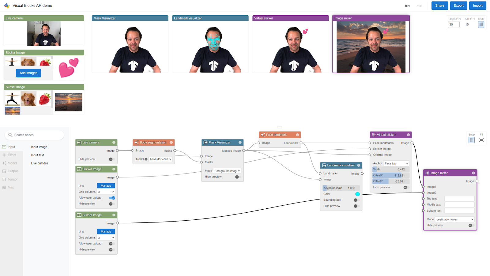
The following screenshot shows Visual Blocks in action whereby the user created a simple augmented reality effect, that transports the user to a different location using background segmentation, and then places some heart imagery hovering above their face, just by connecting off-the-shelf nodes together in less than a minute!
Visual Blocks enables developers and decision-makers alike to work together to solve problems through powerful reusable building blocks, iterate, and then deploy with ease for everyone on your team to try - even if they are less technical. You can then build an end-to-end pipeline for almost any task to share with your team (or the public) in minutes for review or feedback. That's the power of Visual Blocks.
3. Get set up
For this codelab, you can use any code editor you desire. The most important thing to have ready for the end of the workshop, is the ability to host the JavaScript file you create today, in such a way the correct CORS headers are set up to allow Visual Blocks to run your completed code.
What's CORS?
CORS stands for Cross Origin Resource Sharing. In the old days of web development, developers would be able to include arbitrary JavaScript from any website domain without any special permissions. This understandably led to security issues where people may be including code from websites they should not have been allowed to.
As such, with modern web development, in order to include and execute JavaScript from a different domain (wherever you are hosting your JavaScript files), you must ensure that your web server or Content Delivery Network (CDN) e.g. Google Cloud Storage Bucket, is set up with the correct CORS headers to allow execution by the domains that are to run that code.
CORS and Visual Blocks
Visual Blocks is hosted on the domain https://visualblocks.withgoogle.com. As such, to allow the custom code you write today to be used by the Visual Blocks domain, you must add it to the list of allowed domains for wherever you intend to host your final code from today's workshop.
I shall walk you through two common use cases for adding correct CORS headers to the following:
- An Apache 2 web server running from your own machine (via localhost, which is great for testing locally and private, because everything runs from your own device).
- A Google Cloud Storage bucket (great for production or public sharing of a node for others to try with ease).
If you are using a different web server or cloud storage solution then you would need to follow documentation for those. All modern web servers and CDNs should be able to be configured to enable CORS headers on the content you are hosting.
Set up CORS
Choose one of the following setup options depending on your preference. You can either use a local web server, or a cloud storage solution. Examples for both are shown:
Apache 2 local web server setup:
Download Apache2 for your operating system, install it, and start the web server service by following the official documentation. If you are on Ubuntu, you can execute the following commands, line by line, in a new terminal window:
sudo apt update
sudo apt install apache2
sudo a2enmod headers
sudo service apache2 restart
Locate the Apache2 server configuration file named httpd.conf or apache2.conf that should be located somewhere within the folder where you installed Apache. On Linux this can often be edited by running the following command:
sudo nano /etc/apache2/apache2.conf
Once open in your favorite text editor, find the corresponding directory definition for your DocumentRoot folder. On Linux, this usually is the line starting with <Directory /var/www/>.
Finally at the end of this Directory configuration but before the closing </Directory> tag, add a line that sets the CORS header for files served from this web server:
Header set Access-Control-Allow-Origin "https://visualblocks.withgoogle.com"
It should look similar to this when copied in:
<Directory /var/www/>
    Options Indexes FollowSymLinks
    AllowOverride None
    Require all granted

    Header set Access-Control-Allow-Origin "https://visualblocks.withgoogle.com"
</Directory>
Windows users only: If you are a Windows user, search for the line that contains:
#LoadModule headers_module modules/mod_headers.so
Remove the preceding hash symbol to uncomment this line of code. It should then look like this:
LoadModule headers_module modules/mod_headers.so
Save the file and restart your Apache server. On Linux you can do that by executing:
sudo service apache2 restart
Optional: Cloud Storage setup
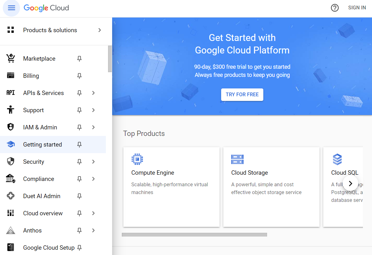
Head over to https://cloud.google.com/ and sign in. If you do not already have a Google Cloud account you need to create one now. As Google Cloud Platform (GCP) is a paid service, you will need to ensure you set up billing to continue, even if you are offered credits without cost as shown in the screenshot below:
Create a new cloud project, and then click Cloud Storage > Buckets.
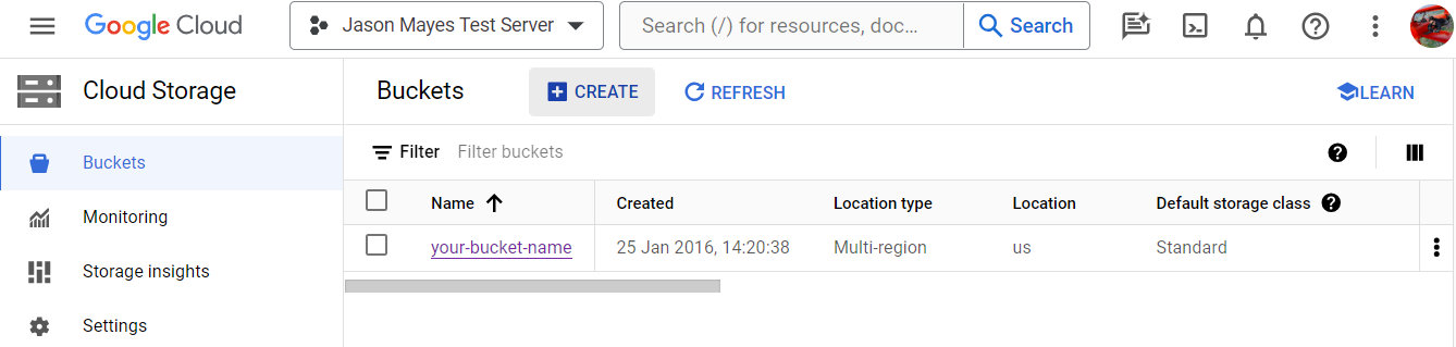
Create a Cloud Storage bucket with your own unique name. Here, we called our example bucket your-bucket-name as shown:

Note that for Visual Blocks to access your file in your Cloud Storage bucket change control access to be unchecked as follows if it was checked by default:

This means any files you upload will be public so that the Visual Blocks website can download and use the file. If you need your code to work privately, use the local web server example shown earlier in this codelab with Apache 2 instead, or set up private access conditions on your cloud bucket for signed-in users who are part of your company (beyond the scope of this tutorial).
Once created, you should see your bucket listed on the Cloud Storage landing page like this:
Activate the Cloud Shell by clicking its icon 
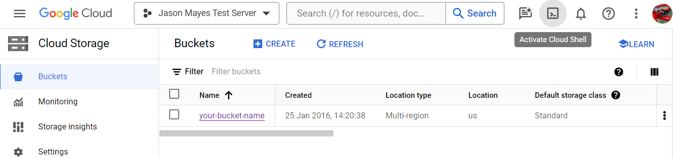
Once provisioned, you have a black console window shown at the bottom of the page like this:

Using this terminal window you will be able to tell the Cloud Storage bucket to serve files with the correct CORS headers for all future files you upload.
Create a new JSON file with the CORS configuration to apply to your bucket:
nano config.json
After pressing the return key, this will create a new file named config.json and opens it in the command line Nano text editor.
Next, paste the following configuration into the nano editor that opened in the terminal window:
[
  {
    "origin": ["https://visualblocks.withgoogle.com"],
    "method": ["GET"],
    "responseHeader": ["Content-Type"],
    "maxAgeSeconds": 3600
  }
]
Once pasted in, press the keys CTRL+O to output and save the contents added to the file.
When asked what filename to use, press Enter to accept the current filename, which should be config.json.

Press CTRL+X to close the command line nano editor and return to the main terminal.
Great, now you have a config file written, it is time to apply it to your bucket.
Run the following command:
gcloud storage buckets update gs://your_bucket_name --cors-file=config.json
Note: Replace your-bucket-name with the bucket name of your own Cloud Storage bucket that you created.
Woohoo! You are now set up with the correct CORS headers for Cloud Storage. You only need to do this once. All future files you upload will have these settings applied by default for this project.
To confirm this, run the following command:
gcloud storage buckets describe gs://your_bucket_name --format="default(cors_config)"
Which should print something similar to the following:

Great! Time to do some actual coding and make your very own custom node in Visual Blocks.
4. What are custom nodes?
Built-in nodes may not always align perfectly with your unique requirements. Imagine you have a proprietary machine learning model for detecting screws on a physical "widget" you are making on a real production line. You want to test and iterate on an idea you had to verify that screws were correctly added to the widget. Here, you want to create a Visual Blocks pipeline that uses your custom object-detection model for screws, instead of one of the default ones that Visual Blocks has, which may not detect screws.
However, at the same time, you want to be able to use your custom model with all the existing nodes Visual Blocks already has, like grabbing the webcam stream from a USB webcam and passing it as an input, along with the bounding box visualizer node to draw a rectangle around the found objects in the image from your own model.
This is a great use case for writing a custom node and is where custom nodes can shine.
Even better, once you have made that custom object detection node, you can share with others either at your company or even publicly so those people can also use it, and try on their own pipelines and hardware, too!
Custom Elements
Custom nodes in Visual Blocks are just regular JavaScript Web Components. Specifically, Visual Blocks uses the custom elements part of the Web Component specification.
This means they are easy to implement, and framework agnostic, as they are well defined standards that all modern web browsers support without any extra dependencies.
A custom element can do anything you want it to do. If you can write it in JavaScript, you can turn it into a custom element to do that "thing", that can then be registered with Visual Blocks for you, or anyone you share it with, to use.
Custom nodes encapsulate specialized logic, for example API calls to a third-party cloud service like Google's Gemini APIs to use state of the art generative AI models. You can even execute your own machine learning models locally on the user's device if you want, using libraries like TensorFlow.js, Transformers.js, or Onnx Runtime Web. It could be any custom logic you write.
Whatever you have in mind, it can all be tailored precisely to your needs. Furthermore, they can work with all our existing Visual Blocks nodes if the input/output types match, so you don't have to reinvent the wheel - allowing you to innovate faster for your custom use case.
Your first custom node
For this codelab you will create a node that takes some text (a string) as an input, makes the text uppercase, and then outputs that transformed string.
There are 3 key components to a custom node, which include the following:
- Node specification definition (also known as a "Node Spec") - defines the inputs, outputs, and other configurable properties of the node.
- Web Component implementation - contains your custom logic.
- Registration of the custom node with Visual Blocks - so that it knows to use it.
By the end of this codelab, you will make a node that looks and behaves like the output shown in the following screenshot, which is capable of upper casing some input text passed to it:

While this may appear very simple, which it is, the act of understanding this will allow you to replace the custom logic part of the code, with whatever you desire, to do much more complex things based on your personal interests.
5. Key components of a custom node
Let's walk through the 3 key components to create a custom node.
Node Specification
This is a JavaScript object that essentially defines the inputs, outputs, and various configurable properties of the node that the user can interface with at run time as illustrated by this image:

All of this useful metadata enables Visual Blocks to render the node correctly when you drag it out into the editor so it understands what can be connected to it, along with what other nodes it can connect to.
An example Node Spec is shown below (don't worry about understanding it just yet - I will walk you through this step by step in the next section):
const NODE_NAME_NODE_SPEC = {
  'id': 'make-uppercase',
  'name': 'Make uppercase',
  'description': 'Transform the input text to uppercase.',
  'category': 'processor',
  'collection': 'Jason Collection',
  'propertySpecs': [
    {
      'name': 'option',
      'type': 'string',
      'editorSpec': {
        'type': 'dropdown',
        'options': [
          {
            'value': 'first-letter',
            'label': 'First letter only'
          },
          {
            'value': 'all-letters',
            'label': 'All letters'
          }
        ]
      }
    }
  ],
  'inputSpecs': [{
    'name': 'text',
    'type': 'string',
    'editorSpec': {
      'type': 'text_input'
    },
  }],
  'outputSpecs': [{
    'name': 'result',
    'type': 'string',
  }]
};
Web Component implementation
This is where you will define a new HTML element that exposes a special function that contains your custom logic. Visual blocks will call this function at runtime with inputs passed to your custom element that you can then access, do something with, and then output some response.
In this codelab the custom logic you'll write will check for the presence of an input, and if one exists it will transform the characters to uppercase, based on some user-selected preference, and then send that transformed output to other connected child nodes.
Registration
Once the Node Spec and the Custom Element logic is defined, you will need to register them with the Visual Blocks framework so it knows that the node is available to use.
Upon registration, it will then be available to find in the nodes panel on the left, enabling you to use your custom node, just like any other.
6. Understanding the Node Specification: Inputs, Outputs, and user interface options
Ok, let's dive deeper and break down the example Node Spec you just saw, so you understand how it was constructed, to then create your own.
Define a constant that will hold the node specification object:
MakeUppercase.js
const NODE_NAME_NODE_SPEC = {
  // New code will go here...
}
As you can see, this is just a regular JavaScript object. Nothing special here other than ensuring the constant name you choose is unique.
Define a property named id inside the node spec object you just created above:
'id': 'make-uppercase',
This is a unique name for a custom HTML element you will create, and must be unique across all nodes registered with Visual Blocks. As such, it's recommended to also prefix your custom node's names with something unique to you or your brand to avoid element name conflicts.
Define the name property of the node spec object:
'name': 'Make uppercase',
This is the human readable name that will appear along the top of the node user interface. Keep it short but understandable so it fits in the title bar as shown:

You can use a regular string with spaces here that is human readable.
Define a description for your node:
'description': 'Transform the input text to uppercase.',
This is a longer form string you can use to explain what the custom node actually does. It appears when you hover over the information icon in the node's user interface as shown:

In the next section of the node spec, define a property called category that will decide what subpanel the node will appear under:
'category': 'processor',
For now, the category value needs to be chosen from a predefined list of strings. It must be one of the following:
input: A node that primarily provides some input into the graph, like a webcam, image, or text input.- output: A node that primarily is concerned with visualizing some output from other nodes.
model: A node whose core logic is around using some AI model.tensor: For nodes that primarily manipulate TensorFlow tensors.search: Any nodes whose primary function is to perform some sort of search across some corpus of data or API.processor: For nodes that primarily transform or process an input to produce a new output.advanced: Aimed at nodes that may perform advanced features, like running arbitrary code or call complex APIs, and be tied to a specific set of niche circumstances in which they can be used versus a generalized solution.
Here you can use the processor category type as you're essentially processing some data in your make-uppercase node. Later, when you add the node to Visual Blocks, it will appear under the Processor tab in the node panel interface shown below:

In the future, we may enable custom node category types, but for now you must use one of the defined ones.
Define a collection property. This allows you to group nodes that do a similar thing, or are by the same company or theme, together:
'collection': 'Jason Collection',
In this case I have defined my collection to be Jason Collection for the purpose of this demo. This means that when the node is added to Visual Blocks, it will appear under a drop-down menu where all nodes that belong to this collection will be shown:

This makes it much easier to find when people from many different companies or with different interests start to submit and share custom nodes with the Visual Blocks community.
Property specs
So far you have defined the general metadata for the node in the node spec. The next part will define exposable properties that the user can configure at runtime.
To do so, follow these steps:
Define a property named propertySpecs that itself defines an array in which you will add objects containing metadata for the property you want to expose:
'propertySpecs': [
  // Property objects will be added here.
],
Add an object inside the propertySpecs array for a drop-down box so the user can choose what type of uppercasing they wish to apply to the input:
    {
      'name': 'option',
      'type': 'string',
      'editorSpec': {
        'type': 'dropdown',
        'options': [
          {
            'value': 'first-letter',
            'label': 'First letter only'
          },
          {
            'value': 'all-letters',
            'label': 'All letters'
          }
        ]
      }
    }
In the code above you defined the following object properties:
name: Must be a valid JavaScript object property name as you will access it as such at runtime in code. The name should be meaningful so it clearly represents what this property represents. This name will also be shown in the user interface as shown in the bottom left of this screenshot:

type: Defines the data type this configurable property will produce. In this instance your dropdown will produce strings, so you can set the type to string. Other possible types you could select from include the following: image, number, boolean, string, color, string[], tensor, tensor[], size, rect, masks, proto.
editorSpec: An object that defines the type of graphical component that will represent this property along with its default options. In this example node you will define an object with the following properties set:
type: The GUI element type to represent the property. This is not the same as the data type you specified above. Here you choosedropdownas the type to use a drop-down selection box, but other graphical types exist as shown too:

For the latest list, check the code.
options: An array of objects containing value-label pairs in the case of the drop-down type. In the code above you defined them as follows:
   [
       {
          'value': 'first-letter',
          'label": "First letter only'
       },
       {
          'value': 'all-letters',
          'label': 'All letters'
       }
   ]
Here value represents the string value that will be passed to you at runtime in JavaScript code, versus the label, which is the human-readable text rendered to the user interface in the drop-down itself as shown:
Input specs
The next part of the Node Spec is concerned with what inputs the node is expecting to receive.
Define inputSpecs after the propertySpecs section as shown:
'inputSpecs': [{
  'name': 'text',
  'type': 'string'
}],
The inputSpecs contains an array of objects that have name and type properties set:
name: The runtime JavaScript object property name you want to call your input. This is also rendered to the user interface of the node. Here you set the name to be called text.
type: The object data type of this input. Here you set the type to string because you expect only text to be passed as inputs to your "Make Uppercase" node. Note that the type value itself is just a string, so it could be anything you want, allowing you to define custom object types you expect to receive too if needed.
Therefore, if you had a custom object type that you wanted to pass as an input, for example an animal object type representing some custom animal class, then the string here could be animal instead.
In that case, you must understand how to process and use the custom type being passed, as Visual Blocks will not enforce checks for custom types. If someone elses' custom node used animal as a type, it would suggest it is compatible with your node as an input, even though it could be a different object entirely, if made by a different user.
You can see how the name of the input defined above (text) is rendered to the user interface of the node at runtime next to the input triangle on the left:
Output specs
The final part of the Node Spec contains the outputs your node will produce. Again it should be noted this is also optional as not all nodes will produce an output if it's a terminal node with no children connected.
Define the outputSpecs property as shown:
'outputSpecs': [{
  'name': 'result',
  'type': 'string'
}]
Just like the inputSpecs that you saw before, you have an array of objects containing names and types defined, in the same manner as you did with the inputs.
Remember to keep the name meaningful and short because you'll use it in your code later, so that can help keep your code understandable and concise. In this case, just like before, your result output will also be of type string.
Excellent! You have just completed understanding all the key components of the Node Spec.
Below is the completed code for what you just learnt:
MakeUppercase.js
const NODE_NAME_NODE_SPEC = {
  'id': 'make-uppercase',
  'name': 'Make uppercase',
  'description': 'Transform the input text to uppercase.',
  'category': 'processor',
  'collection': 'Jason Collection',
  'propertySpecs': [
    {
      'name': 'option',
      'type': 'string',
      'editorSpec': {
        'type': 'dropdown',
        'options': [
          {
            'value': 'first-letter',
            'label': 'First letter only'
          },
          {
            'value': 'all-letters',
            'label': 'All letters'
          }
        ]
      }
    }
  ],
  'inputSpecs': [{
    'name': 'text',
    'type': 'string',
    'editorSpec': {
      'type': 'text_input'
    },
  }],
  'outputSpecs': [{
    'name': 'result',
    'type': 'string',
  }]
};
Now it's time to move on to defining a custom element to write your custom logic for the node.
7. Implementing Custom Elements for your node's logic
As the Node Spec is defined, the next step is to define a custom element that will contain your logic that the node will execute. Let's walk through that now.
The following code would be appended below the Node Spec that was just defined in your MakeUppercase.js file:
class MakeUppercase extends HTMLElement {
  constructor() {
    super();
  }

  runWithInputs(inputs) {
    let {text, option} = inputs;
    const upperText = option === 'first-letter' ?
        (text.charAt(0).toUpperCase() + text.slice(1)) : text.toUpperCase();

    this.dispatchEvent(new CustomEvent('outputs', {detail: {
        result: upperText}}));
  }
}
Let's break this code down:
First you'll define a new class with a name that matches your node's name:
class MakeUppercase extends HTMLElement {

}
Here you call the class "MakeUppercase". This class extends the HTMLElement class because you are creating a new instance of a HTML element that Visual Blocks will use later.
Inside your MakeUppercase class, define the constructor:
  constructor() {
    super();
  }
In this instance you just call the super() function to ensure the HTML Element is instantiated correctly by the default constructor of the HTMLElement class you are extending.
Then you create a runWithInputs function that's also part of the MakeUppercase class:
  runWithInputs(inputs) {

  }
Visual Blocks expects all custom nodes to contain this special custom function. This is where you will write all your custom logic to process the inputs passed at runtime.
Naturally you could define other functions too if needed, to help implement the logic you want to perform. However, Visual Blocks will itself only call the runWithInputs function.
You then add code to this new function to destructure the inputs object and grab the input data passed to the node at runtime along with the user chosen properties from the node's graphical interface:
  runWithInputs(inputs) {
    let {text, option} = inputs;
  }
Here you can use the JavaScript destructuring syntax to extract the text and option variables that are contained in the inputs object.
You now have access to the input text from a connected node along with the option value currently selected from the drop-down on the MakeUppercase node.
Here you will write some custom logic to uppercase either the first letter, or the whole input string, depending on what the value of the drop-down was for this custom node that the user dragged out and configured:
  runWithInputs(inputs) {
    let {text, option} = inputs;
    const upperText = option === 'first-letter' ?
        (text.charAt(0).toUpperCase() + text.slice(1)) : text.toUpperCase();
  }
Once you have a result to pass on, it's time to dispatch an event with some output, that you want your node to send on to any child nodes that the node is connected to as follows:
  runWithInputs(inputs) {
    let {text, option} = inputs;
    const upperText = option === 'first-letter' ?
        (text.charAt(0).toUpperCase() + text.slice(1)) : text.toUpperCase();

    this.dispatchEvent(new CustomEvent('outputs', {detail: {
        result: upperText}}));
  }
Here you need to call the this.DispatchEvent method, to which you pass a new CustomEvent of type outputs, whose value is an object that contains a property named detail, which itself contains an object named result. Note that result is the name of the output that you defined in the node spec earlier on.
The result's property value can then be your uppercased string calculated in the prior section as your node is expected to output a string type.
8. Register and use your custom node
Now that the MakeUppercase class code is complete, the only thing left to do is to register it with Visual Blocks.
To do that, call the visualblocks.registerCustomNode method and pass an object that contains the following two properties:
- The node specification that you defined at the very start.
- The node's custom element class implementation you just wrote.
At the end of your MakeUppercase.js file, after the MakeUppercase class definition, you can add the following lines of code to implement the registration:
visualblocks.registerCustomNode(
  {nodeSpec: NODE_NAME_NODE_SPEC, nodeImpl: MakeUppercase}
);
As you can see, you just pass an object to the visualblocks.registerCustomNode method that contains a property named nodeSpec whose value is the NODE_NAME_NODE_SPEC you defined at the start of this codelab, along with a nodeImpl property whose value is the MakeUppercase class you just wrote in the prior section.
Congratulations you've now fully coded your first custom node, but how do you use it?
Hosting your MakeUppercase.js file
At this point, if you followed along correctly, your completed MakeUppercase.js file should look exactly like this:
const NODE_SPEC = {
  'id': 'make-uppercase',
  'name': 'Make uppercase',
  'description': 'Transform the input text to uppercase.',

  'category': 'processor',
  'collection': 'Jason Collection',

  // Properties.
  'propertySpecs': [
    {
      'name': 'option',
      'type': 'string',
      'editorSpec': {
        'type': 'dropdown',
        'options': [
          {
            'value': 'first-letter',
            'label': 'First letter only'
          },
          {
            'value': 'all-letters',
            'label': 'All letters'
          }
        ]
      }
    }
  ],

  // Inputs.
  'inputSpecs': [{
    'name': 'text',
    'type': 'string'
  }],

  // Outputs.
  'outputSpecs': [{
    'name': 'result',
    'type': 'string',
  }]
};


class MakeUppercase extends HTMLElement {
  constructor() {
    super();
  }

  runWithInputs(inputs) {
    let {text, option} = inputs;
    const upperText = option === 'first-letter' ?
        (text.charAt(0).toUpperCase() + text.slice(1)) : text.toUpperCase();

    this.dispatchEvent(new CustomEvent('outputs', {detail: {
        result: upperText}}));
  }
}


visualblocks.registerCustomNode({nodeSpec: NODE_SPEC, nodeImpl: MakeUppercase});
Save your file to your Cloud Storage bucket or local web server as described in the Get Set Up section of this codelab.
You need to ensure the makeUppercase.js file you just wrote is being served from a web server or content delivery network (CDN) with the correct CORS headers set, so that Visual Blocks is allowed to include and run the JavaScript file. Ensure the https://visualblocks.withgoogle.com domain is allowed in the CORS setup.
Use your custom node in Visual Blocks
Great! You are now ready to use your custom node.
Import your node
Click the black circular plus icon 

Copy the URL of your hosted makeUppercase.js file and add it to the text area as shown in the dialog. Here, I am using an example hosted on a local web server on my own machine using the localhost url:

You can add multiple custom elements, one per line, if you wish.
Click the blue Submit button. If all went well, you should see a green checkbox appear as shown that indicates the successful import of your custom node to Visual Blocks:

If you have errors, check the browser console to see what the issue is with your code syntax.
Use your imported node
Remember in this tutorial you defined the make-uppercase node to be part of a collection in the node specification you defined.
Select the collection drop down in the user interface to find your custom collection name and then find your custom node under the "processor" node tab in the panel below:

Drag your custom node out to the Visual Blocks editor just like you would any other node and start using it:

The below image shows two instances of the custom node in action. The first in green uses default settings to only uppercase the first character. In the second flow in blue, the user configured the drop-down to apply uppercasing to all letters in the string:

It works! While this is a very simple example, remember you could change the custom logic, inputs, or outputs to do whatever you want. It is time to get creative. What piece of logic at your company or job could you turn into a node that anyone else could then use with ease? For example, you could adapt this code to call a large language model (LLM) instead based on the input text passed.
9. Expose a custom user interface
Now that you have a working node, you may have noticed that other nodes in Visual Blocks have their own user interfaces that you can use for various inputs and outputs to the node itself.
How do you do that? In this section you will upgrade your custom node code to expose a simple text area interface in the viewer panel of Visual Blocks so users don't even have to connect an input node to try things as shown:

Pretty neat, let's edit your code to work in this form instead so you understand how to make custom graphical elements in your future creations.
Refactor your constructor
In the makeUppercase.js file, find the constructor inside the MakeUppercase class.
Update the constructor to use the following code:
 constructor() {
    super();
    this.textArea = undefined;
    this.attachShadow({mode: "open"});
    this.render();
 }
Let's break down these three new lines of code:
- The first line defines a variable named
textAreato hold a reference to the HTML text area element you'll add shortly in the next section so you can reference it with ease later from a given instance of the custom element. For now, you just set it toundefined. - The second line attaches a "shadow DOM" to your custom element. Not sure what that is? To learn more, see Using Shadow Dom. Essentially, it allows you to create arbitrary HTML inside of the custom element that's encapsulated within the element, meaning that this HTML is the custom element itself. As you may expect, in order to manipulate its typically hidden HTML, you need to set
modetoopenso that you may grab references to the HTML elements in its shadow DOM later. If it wereclosed, then you would not be able to access the HTML elements created inside of the custom element because they would be protected. - The third line calls a new
renderfunction that you define in the next section.
Create a new render function
Ok, now it is time to define the new render() function. This is a new function that you can add after the constructor definition for your MakeUppercase class, and will allow you to add the required HTML and CSS to the custom element so that you can expose a custom user interface that this element will use when rendered to the webpage:
 render() {
   this.shadowRoot.innerHTML = `
        <style>
          textarea {
            width: 100%;
            height: 100%;
            border: none;
          }
        </style>
        <textarea id="textArea"></textarea>`;

   this.textArea = this.shadowRoot.getElementById('textArea');

   this.textArea.addEventListener('blur', function() {
      this.dispatchEvent(new CustomEvent('pipelineRerunTrigger'));
   }.bind(this));
 }
Let's break the above code down and walk through each section:
First you add the CSS and HTML that will represent this custom element:
   this.shadowRoot.innerHTML = `
        <style>
          textarea {
            width: 100%;
            height: 100%;
            border: none;
          }
        </style>
        <textarea id="textArea"></textarea>`;
In the above code, you add the desired CSS and HTML to the element's Shadow DOM by calling the this.shadowRoot.innerHTML method. Note the use of the special backticks instead of regular single quotation marks to allow for a multi-line HTML definition to be assigned to keep things readable.
In this case, you are manually setting CSS style properties in the HTML itself for ease of following along in this tutorial. However, it is recommended to split this into its own CSS file to follow best practices.
While this tutorial is not an education on CSS or HTML, you can see here the CSS just makes this text area fill the width and height of the custom element itself, and removes any default border rendering the browser may apply, so it looks great in Visual Blocks when rendered.
Finally, in this code, you also define a HTML textarea element with ID of "textArea", which is what the user will use to input text at runtime.
Next, you grab a reference to the textarea, just like you would do for any HTML element on a regular page. The only difference is that you must use this.shadowRoot to grab a reference to the instance of this custom element's shadow DOM instead of the webpage document DOM:
this.textArea = this.shadowRoot.getElementById('textArea');
You can then use typical JavaScript functions like getElementByID to fetch a reference to the textarea, which you then assign to an instance variable named this.textArea so you can easily access it later from other functions in your custom element.
Add three more lines of code to the render() function as shown:
   this.textArea.addEventListener('blur', function() {
      this.dispatchEvent(new CustomEvent('pipelineRerunTrigger'));
   }.bind(this));
Let's break them down line by line:
- Add an event listener on the newly added text area for the
blurevent. It will detect when thetextareahas lost focus, for example, when you click out of it. In this case when the user has finished editing the text and clicked out of the node, you want to trigger a rerun of your node's pipeline. - To trigger a rerun of your node's custom logic, you can dispatch a new custom
pipelineRerunTriggerevent on this instance of the custom element to instruct Visual Blocks to rerun yourrunWithInputsfunction. - Finally, don't forget to
bindthe function that is being called on the blur event to ensure its context for thethiskeyword is to the instance of the custom element itself instead of thetextareathat actually fired theblurevent. This allows you to correctly dispatch thepipelineRerunTriggerevent on the custom element itself and not thetextarea.
Update your runWithInputs logic
Ok, you're almost there! The last edit you need to make is to update your existing runWithInputs function to check if some other node was connected as an input with text to be used, and if not, overwrite the empty text input to be the value from the textarea user interface you just created instead:
 runWithInputs(inputs) {
  let {text, option} = inputs;

  if (text === '') {
    text = this.textArea.value;
  }

  const upperText = option === 'first-letter' ?
      (text.charAt(0).toUpperCase() + text.slice(1)) : text.toUpperCase();

  this.dispatchEvent(new CustomEvent('outputs', {detail: {'result':
      upperText}}));
}
All the rest of the code in the runWithInputs function is the same as before.
Try your new code
Refresh the Visual Blocks page once you have saved the new version of your custom node code.
Now drag out the new node and type into the custom user interface you just made! Note how you don't need to connect any input text nodes, making for a nicer, self-contained user experience:
However, user's of your node can still choose to connect their own text inputs if they desire, which gives the user a choice as to how they wish to use your node. We recommend providing choice here because not everyone will want to use your graphical interface if they need to use your node with some custom pre-processing logic of their own in a different node before the text is passed to your logic.
If you are unable to host your new code yourself, add our completed example node to Visual Blocks instead to try this. A new node named Make Uppercase GUI will appear to use instead.
Can nodes have multiple inputs?
Yes they can! If you wanted to accept multiple strings as inputs, you can do that by setting the property multiple to true in your input specs as shown:
'inputSpecs': [
  {
    'name': 'texts',
    'type': 'string',
    'multiple': true
  }
],
You can then have many strings being passed as an input to your custom node. In that case, you would need to update your runWithInputs function to cycle through an array of strings, instead of a single string.
For example code that demonstrates how to do that, see https://goo.gle/VBUpperCaseFinal and try it in Visual Blocks, where multiple strings will be concatenated and then uppercased instead:

Okay, on to the final section to wrap up what you have learned today.
10. Congratulations
In this codelab, you've seen the power of Visual Blocks, along with how to make your very own custom nodes to work with any ecosystem, including yours.
While some custom nodes you might want to keep private, we hope that the wider community will contribute reusable ones – for example, to common third party APIs or useful custom logic for inputs, processing, or output visualizers – that may be helpful to everyone.
We look forward to seeing the community grow!
Recap
In this codelab you:
Understood what Visual Blocks is and what custom nodes are.
Learned how to host static files with CORS headers set correctly.
Implemented your first custom node that transformed some input text to produce an output. To do this you learned the 3 key parts of a custom node:
- The input specification object
- The custom element implementation for custom logic
- The registration code so Visual Blocks knows to use it
Added a custom graphical user interface for your node.
Next steps
Share what you make with us! You can easily extend what you created for this codelab to other creative use cases too. We encourage you to think outside the box and keep hacking after you are finished.
What will you make next? It would be quite straightforward to take what you have learned today, and instead of upper casing the input text, use it as a prompt to a large language model, grab the result, and output the response - creating a very powerful node indeed. The choice is yours!
- Tag us on social media using #VisualBlocks for a chance to have your project to be featured at future Google events.
- Got further questions? Reach out to our Web AI lead, Jason Mayes, on LinkedIn or Twitter.