
1. Before you begin
A moodboard is a collage of elements, typically visual, that represent the character or style of a design deliverable. For example, a collage of photos and colors to express the look and feel of a brand.

Imagine that you need to apply these assets to an app and design the rest of the theme with complementary attributes while:
- Follow app accessibility guidelines.
- Ensure low maintenance and easy handoff.
- Ideally create a cross-platform theme.
Material Design 3, or Material 3 or M3, can help you accomplish these tasks. Material Design is an adaptable system of guidelines, components, and tools that support the best practices of UI design. Backed by open source code, Material 3 is the latest version of Google's open source design system.
In this codelab, you learn how your brand guidelines and M3 theming can work together to create an accessible and personalized experience, from building up a custom theme to developer handoff with tools to help along the way.
Prerequisites
- Knowledge of Figma styles and variables
- Optional: Visualizing dynamic color in your app codelab
What you learn
- How to convert your brand's attributes to an accessible app theme.
- How to use Material 3 to create app UI theming.
- How to build a branded or custom app theme.
- How to preview your theme and hand it off to a developer.
What you need
2. Theming overview
Material Design theming consists of three style attributes that let you customize the look and feel of your app. This section reviews these attributes.
Color

Color is used to express style and convey meaning that's significant to the user, brand, or semantics. The color system handles the variability of dynamically changing color schemes that arise as user inputs change.
Color is applied to the UI through a color scheme, or a set of grouped color roles that are divided into accent, surface, and semantic colors.
Type
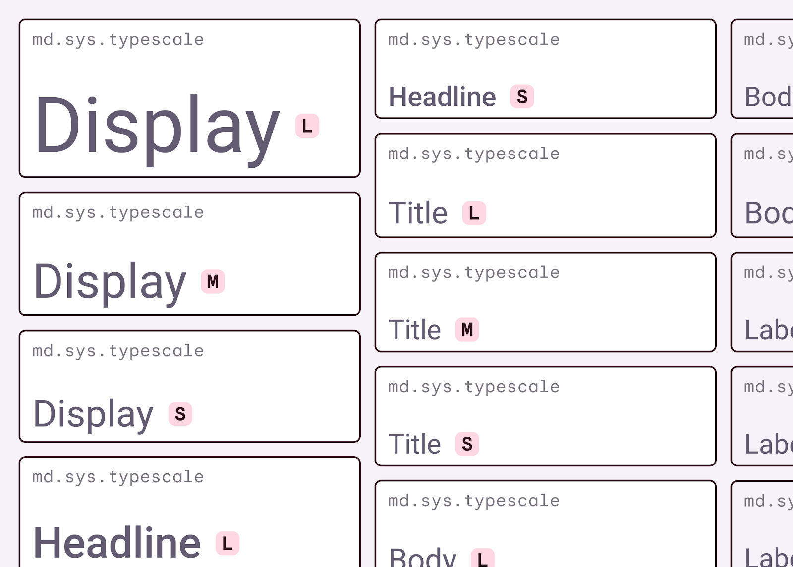
A type scale is similar to the color scheme made of color roles. Font styles are assigned and grouped by use and along a size scale. The Material Design type scale is a combination of 15 styles, each with an intended application and meaning. Roboto is the baseline font assigned to the Material type scale, but it can be customized for your branding.
Shape

The Material shape scale is a range of seven corner shape styles defining the amount of cut or roundedness: none, extra small, small, medium, large, extra large, and full.
Roles and tokens
A role is any semantic name for a theme property and helps determine where it belongs or what it's used for. For example, On Primary is the role semantic name for the color that is used for UI elements that are on top of elements assigned with Primary. These roles are mapped to specific UI elements in components. While they can be remapped, they should still stick to their corresponding roles.
The roles, like tokens, provide a way of addressing properties without specifying values while speaking to the actual use case for the property.
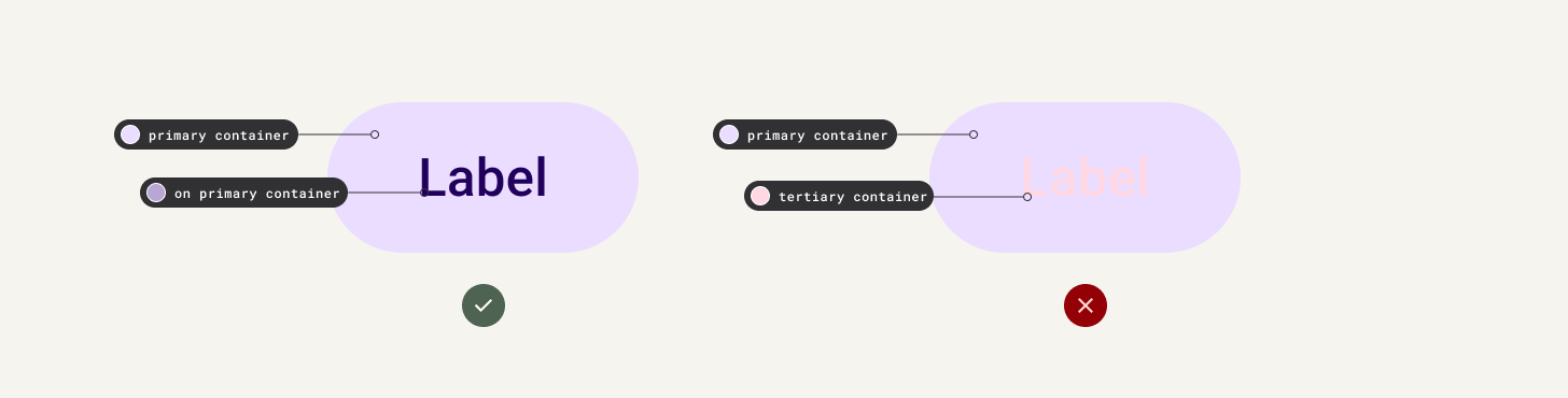
Roles have self-explanatory use cases that you should keep. Do not mix corresponding roles as this could result in accessibility loss.
Brand and theming
When beginning to build an app or product, you may already have an existing brand definition and elements, such as a logo, color palettes, and custom typefaces.
All of the elements can come together in Material Design to create an app that successfully expresses your brand's unique identity. By building your brand with theming in mind, your app will benefit from the following:
- Easier handoff and management through common design and development properties, language, and deliverables.
- A brand and theme that are cohesive and accessible.
- Less surprises during implementation.
The Material subsystems are similar to attributes found in a style guide, so the two can be shared or even built together.
3. Build a color scheme

Considerations and accessibility
In your moodboard, only one color is given, a primary color used in the logo. If you look at the tonal value, or brightness, it is around 50. As a result, any other color you use the color on will not have sufficient contrast. Instead of using this provided color directly in the UI, you explore some methods to find related colors that will be more accessible and cohesive within the app. For more information about accessibility in colors, see Designing with accessible colors.
Material 3 uses a color algorithm that creates an accessible color scheme by first creating shifted key colors and tonal palettes to then map to a color scheme. This is used to create user wallpaper schemes. While we suggest using the same process for your app's theme, it isn't necessary, and either the key colors or resulting scheme colors can be overridden to a degree. This consideration is important to make your app as inclusive as possible and more legible in different contexts.
Look and feel
Color is a powerful expressive language that can conjure up different vibes, evoke different feelings, and help to characterize your brand. Brand archetypes can often utilize the similar colors to evoke these characterizations. Take a look around at corporate logos; the color palette will typically have a not-too-saturated primary color with neutrals filling out the rest, which gives a corporate neutral look and feel.
To help consider the persona characteristics when building your brand: childish or corporate or avant garde. You can even juxtapose or do the opposite for something unexpected.
For example, the following image contains a set of corporate-feeling colors and youthful-feeling colors:

Build a color scheme
Now you can begin to build a brand and turn it into an app theme.
To create a color scheme from the provided moodboard, follow these steps:
- To create a primary color, select the large color swatch labeled primary and find the hex value.

- Open the Material Theme Builder plugin. The file already has the initial M3 baseline generated to save time.
- Scroll to the Core scheme section, and then click the primary color well and update the hex value. The other core colors are already populated.

You could stop there. A full scheme is already created and derived from the given color, but let's see what the color algorithm will create from your other brand assets.

- In the Source image section, click Choose image and select one of the moodboard images. Similar to adding a primary key color, adding an image fills all key colors.

- In your settings, select the Color match checkbox, and then either add the image again or primary key color. This results in a color scheme closer to your inputs instead of the tonal spot variant.

- Optional: Update the secondary and tertiary colors to reflect the brand look and feel. You can adjust the secondary color to something more analogous next to the primary hue on a color wheel. Secondary or tertiary colors with higher saturation result in colors that outshine the primary color.
- Click Update. This applies the changes made in the plugin to the generated color scheme.

After you update the colors, the following elements automatically update:
- Color schematic: This is the color scheme used for your app that's mapped to color roles.
- Tonal palettes: This is for reference only and used to derive the color scheme. Tonal palettes display a hue through different tonal steps.
- Styles: Figma styles, which you can access through the property panels to assign.
- Variables: Figma variables, which you can access through the property panels to assign.
While the tonal palettes are nice to have for reference, they're neither necessary for the app's theme nor used to implement it.
4. Apply color to a UI

Color hierarchy
When applying color roles to your mockups, consider the order of importance, or hierarchy, of your elements. This concept will help assign brand colors to their respective roles, but also map them within the UI.
Colors are applied in a hierarchy with primary color and its respective roles assigned to crucial calls to action (CTAs). We recommend high-emphasis components such as floating action buttons (FABs) to take on primary roles. More vibrant colors can help signify actions of greater prominence in your app's visual hierarchy as they draw the eye first. Consider the order in which you want your users to engage with your UI and content to help assign color roles. Not all components should use primary.
Material components have preassigned color roles, but you can use color tokens throughout your UI and custom elements.
When assigning colors consider the color roles and groupings, accent colors usually exhibit the most expressiveness within a UI, whether it's for branding, highlighting actions, personal expression, or user expression.
Semantic colors are colors that have assigned specific meanings. For example, error is a semantic color.
Surface colors are designed for background elements, such as component containers, sheets, and panes. They represent the majority of your app's colors. Don't be shy to use lots of surface space; the human eye needs space to relax. Surfaces also help contain content and direct the reader.
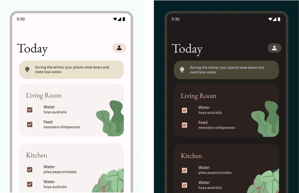
Apply color to a UI

- Navigate to the mockups labeled theme examples.
- Select the app's background and assign Surface.
- Use the rest of the Surface container roles from low to high, and assign them to the larger component backgrounds in respect to their current gray tone. This includes all cards.
- For accent colors, assign the highest-priority element's container with Primary container and the On primary container.
- Repeat with secondary and tertiary color roles. You may find most elements on the screen have secondary or tertiary color roles as they are not the primary focus.
- Optional: See how using the main accent role versus the accent container role changes the look and feel of the UI along with hierarchy.

5. Build a type scale
Every platform comes with a default or built-in set of fonts that can be accessed called system fonts. While the system fonts can be customized for most platforms, it can be good to use them due to certain built-in features. For Android, the system font is the typeface Roboto, meaning any app by default can use Roboto. You're going to override the system font with type theming and a customized type scale.
Considerations and accessibility

To make your type scale legible so that users can see text without strain, remember the following:
- The Material type scale is created to be an optimal baseline experience.
- If making adjustments to sizing, always test and don't set anything to less than 10 scalable pixels (sp).
- Set text with sp so that users can customize their font size through system settings by setting text with sp.
- Text can appear differently in different user contexts. For example, on dark backgrounds, thin type can be difficult to read, so it's important to provide a heavier weight.
Look and feel
Similar to color, type can evoke different feelings which can be used to characterize your brand in your UI. Whether a serious Serif for a corporate look or a handwritten display for a handcrafted feel. Consider the characteristics of the typeface to match the moodboard.

Type has historically been classified into groups to make distinguishing them easier. For example, Sans Serifs (without serifs) are grouped as Geometric, Humanist, and Grotesque. More descriptive classifications include display, handwriting, and monospace.
One typeface can be the safer choice if not comfortable with typography, and can come with many styles to use or may not be needed. But you may run into contexts that are enhanced or even require a second typeface. When pairing a second typeface, think of the use case. For example:
- Pick a more characteristic typeface for larger display roles and a highly readable serif or sans serif for the smaller body roles.
- The secondary typeface could be used for specialized cases, like numerals in data.
Build a type scale
Now to add typography to your style guide by customizing the Material type scale. You'll use the Material Theme Builder again.

You start with the display font. As the largest text on the screen, display styles are reserved for short, important text or numerals. Here, you can choose a more expressive font due to the larger size.
- Explore display fonts on Google Fonts. Considering the characteristics of your moodboard, use the filters to refine and enter your app name to find a typeface that matches your look and feel.
- In the Material Theme Builder plugin, select the Type tab, and then select Display font and search for the chosen typeface.
- Explore body fonts on Google Fonts. Consider that the body fonts, which include body, label, and title roles, need to be highly legible due to their smaller sizes and roles.
- In the Material Theme Builder plugin, select the Type tab, and thenselect Body font and search for the chosen typeface.
- Click Update. This updates the Figma type styles along with the type scale in the style guide section.
6. Apply fonts to UI
Hierarchy
Hierarchy is communicated through differences in font weight, size, line height, and letter spacing. The updated type scale organizes styles into five roles that are named to describe their purposes: display, headline, title, label, and body. The new roles are device-agnostic, allowing easier application across a variety of use cases.
Apply fonts to UI
- Move to the mockups labeled Theme examples. Currently, only sizes are applied to the mocks, but not styles.
- Assign the larger font sizes to display and headline styles.
- Repeat with title, label, and body. When setting the role, consider what the element's use is.

7. Shape
M3 shape scale
The scale is a range of seven corner shape styles defining the amount of cut or roundedness: none, extra small, small, medium, large, extra large, and full.
By default, all roles use the rounded shape family. Most values are expressed in absolute dp measurements, except for the full style which is expressed in percentage.
Shape can be defined through the shape family (rounded or cut) and value (1 through 7).
These shape rules may need to vary depending on the components to fit together. For example, having a larger border radius on container elements compared to smaller values for internal elements.
Characteristics of shape
As with color and type, shape can help express the look and feel of a brand. The shape family and value can change the look and feel.
Rounded is often seen as a friendly or softer look.
Cut corners can give a distinctive or traditional look depending on the degree.
Of course leaving the value at 0 will be harsher, but can provide a modern approach.
Consider how color and type combines with shape. Here is an example with no corner rounding, but different color and font used to create different looks:

Define shape
- Define the shape family and values for development by updating the components so that they are reflected in the mockups. Don't forget custom components!
- Update the style guide to include shape by notating the provided small, medium, and large components.

8. Motion
Motion makes a UI expressive and easy to use. Motion can help direct through the UI, signal actions, and provide feedback to users. The easing and duration can add branding expression to that motion.
Material includes easing and duration slots to customize the motion library through tokens. These tokens should be expressed through notation and prototyping for developer handoff.
9. Hand off to a developer
To use the Material Theme Builder plugin to export an implementable theme file for color and type, follow these steps:
- In the plugin, click Export and then select your platform from the menu. Shape and other style attributes can be provided for implementation through Figma specs, but make sure they are documented!
- Share the downloaded files with your developer.
10. Congratulations
Great job! You now have a brand style guide, themed mockups, and implementable theme files.

Learn more
- Follow youtube.com/MaterialDesign for more design content and tutorials.
- Expand your style guide with content design, icons, and elevation.
- If you've got questions, contact us at @MaterialDesign on X.
- Implement Material 3 theming in Compose.