
1. Before you begin
SociaLite demonstrates how to use various Android platform APIs to implement features that are commonly seen in social-network apps, leveraging a variety of Jetpack APIs to achieve complex functionalities that work reliably on more devices and require less code.
This codelab walks you through the process of making the SociaLite app compatible with the Android 15 edge-to-edge enforcement and making the app edge-to-edge in a backward-compatible way. After going edge-to-edge, SociaLite will look like the following, depending on your device and navigation mode:
SociaLite with three-button navigation | SociaLite with gesture navigation |


SociaLite on a large screen device |
Prerequisites
- Basic Kotlin knowledge.
- Completion of the Setup Android Studio codelab, or familiarity with how to use Android Studio and test apps in an emulator or physical device running Android 15.
What you learn
- How to handle Android 15 edge-to-edge changes.
- How to make your app edge-to-edge in a backward compatible way.
What you need
- The latest version of Android Studio.
- A test device or emulator running Android 15 Beta 1 or higher.
- An Android 15 Beta 1 SDK or higher.
2. Get the starter code
- Download the starter code from GitHub.
Alternatively, clone the repository and check out the codelab_improve_android_experience_2024 branch.
$ git clone git@github.com:android/socialite.git
$ cd socialite
$ git checkout codelab_improve_android_experience_2024
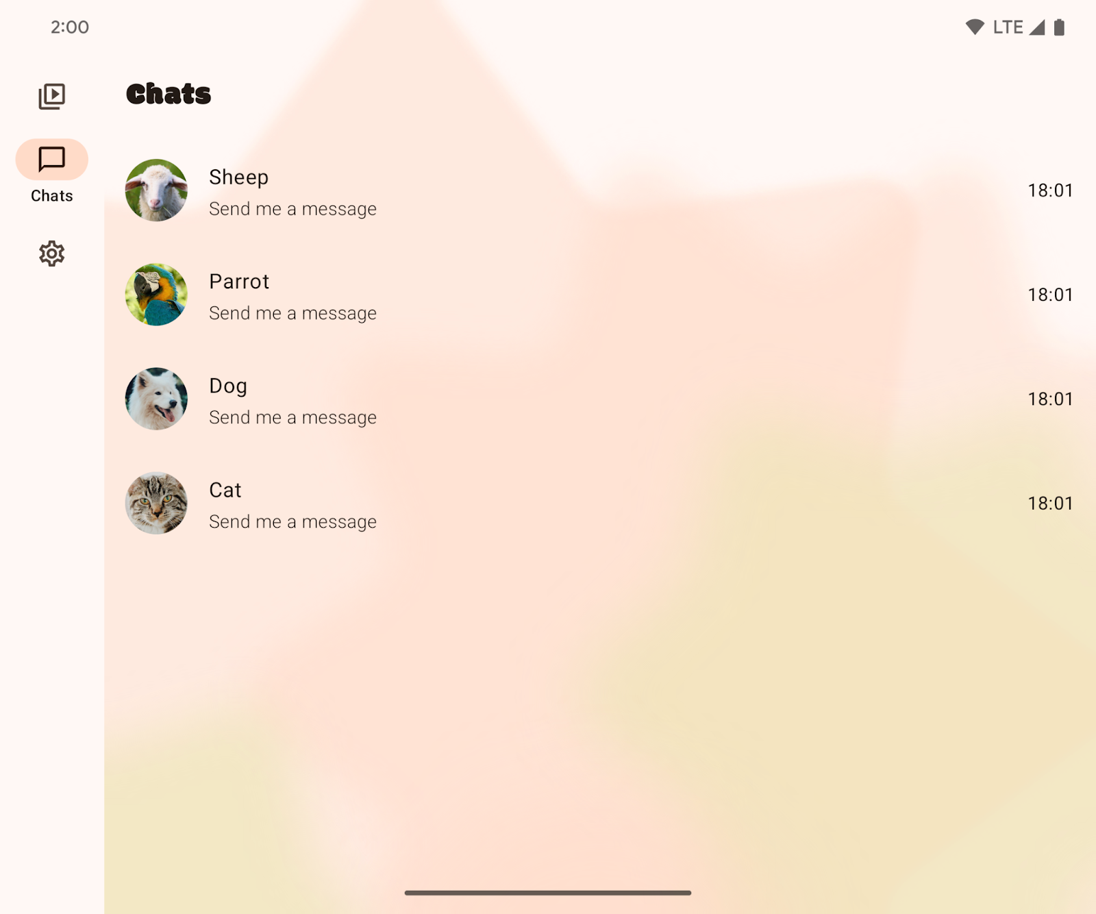
- Open SociaLite in Android Studio and run the app on your Android 15 device or emulator. You see a screen that looks like one of the following:
Three-button navigation | Gesture navigation |


Large screen |
- On the Chats page, select one of the conversations, such as the one with the dog.
Dog chat message with three-button navigation | Dog chat message with gesture navigation |
3. Make your app edge-to-edge on Android 15
What is edge-to-edge?
Apps can draw behind the system bars, allowing for a polished user experience and full use of the display space. This is called going edge-to-edge.
How to handle Android 15 edge-to-edge changes
Before Android 15, your app's UI by default is restricted to being laid out such that it avoids the system bar areas, like the status bar and navigation bar. Apps opted-into going edge-to-edge. Depending on the app, opting-in could range from being trivial to cumbersome.
Starting in Android 15, your app will be edge-to-edge by default. You'll see the following defaults:
- Three-button navigation bar is translucent.
- Gesture navigation bar is transparent.
- Status bar is transparent.
- Unless content applies insets or padding, content will draw behind system bars, like the navigation bar, status bar, and caption bar.
This ensures edge-to-edge is not overlooked as a means of increasing app quality and reduces the work required for your app to go edge-to-edge. However, this change may negatively impact your app. You'll see two examples of negative impacts within SociaLite after you upgrade the target SDK to Android 15.
Change the target SDK value to Android 15
- Within SociaLite's app's build.gradle file, change the target and compile SDK versions to Android 15 or
VanillaIceCream.
If you are taking this codelab before the stable release of Android 15, the code will look like this:
android {
    namespace = "com.google.android.samples.socialite"
    compileSdkPreview = "VanillaIceCream"

    defaultConfig {
        applicationId = "com.google.android.samples.socialite"
        minSdk = 21
        targetSdkPreview = "VanillaIceCream"
        ...
    }
...
}
If you are taking this codelab after the stable release of Android 15, the code will look like this:
android {
    namespace = "com.google.android.samples.socialite"
    compileSdk = 35

    defaultConfig {
        applicationId = "com.google.android.samples.socialite"
        minSdk = 21
        targetSdk = 35
        ...
    }
...
}
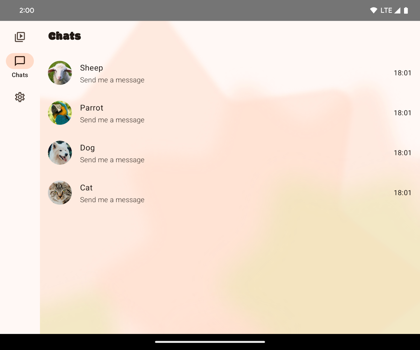
- Rebuild SociaLite and observe the following issues:
- Three-button navigation background protection does not match the navigation bar. The Chats screen looks edge-to-edge without any intervention on your end for gesture navigation. However, there is three-button navigation background protection that should be removed.
Chats screen with three-button navigation | Chats screen with gesture navigation |

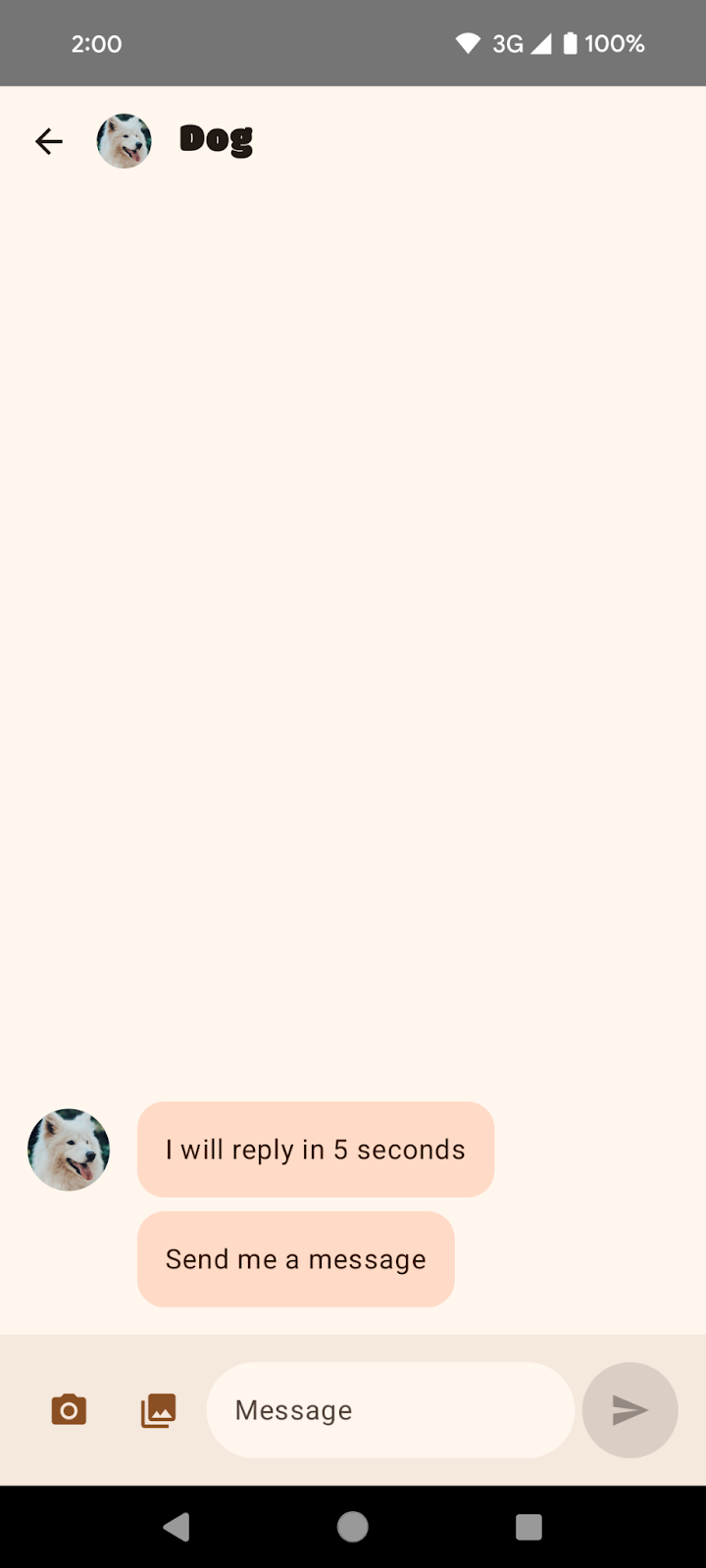
- Occluded UI. A conversation has the bottom UI elements occluded by the navigation bars. This is most apparent in three-button navigation.
Dog chat message with three-button navigation | Dog chat message with gesture navigation |

Fix SociaLite
To remove default three-button navigation background protection, follow these steps:
- In the
MainActivity.ktfile, remove the default background protection by setting the window.isNavigationBarContrastEnforced property to false.
class MainActivity : ComponentActivity() {
    override fun onCreate(savedInstanceState: Bundle?) {
        installSplashScreen()
        super.onCreate(savedInstanceState)
        setContent {
            // Add this block:
            if (Build.VERSION.SDK_INT >= Build.VERSION_CODES.Q) {
                window.isNavigationBarContrastEnforced = false
            }
        }
    }
    ...
}
window.isNavigationBarContrastEnforced ensures that the navigation bar has enough contrast when a fully transparent background is requested. By setting this attribute to false, you are effectively setting the three-button navigation background to transparent. window.isNavigationBarContrastEnforced will only impact three-button navigation and has no impact on gesture navigation.
- Rerun the app and view one of the conversations on your Android 15 device. The Timeline, Chats, and Settings screens now all appear edge-to-edge. The app's
NavigationBar(with the Timeline, Chats, and Settings buttons) are drawn behind the system's transparent three-button navigation bar.
Chats screen with banding removed | No changes in gesture navigation |

However, notice that the conversation's InputBar is still occluded by the system bars. You need to properly handle insets to fix this issue.
Dog conversation in three-button navigation. The input field at the bottom is occluded by the system's navigation bar. | Dog conversation in gesture navigation. The input field at the bottom is occluded by the system's navigation bar. |


In SociaLite, the InputBar is obscured. In practice, you may find elements at the top, bottom, left, and right obscured when you rotate to landscape mode or when you're on a large-screen device. You need to consider how to handle insets for all these use cases. For SociaLite, you apply padding to bump up the tappable content of the InputBar.
To apply insets to fix occluded UI, follow these steps:
- Navigate to the
ui/chat/ChatScreen.ktfile and then find theChatContentcomposable around line 178, which contains the UI for the conversation screen.ChatContenttakes advantage ofScaffoldto easily construct UI. By default,Scaffoldprovides information about the system UI, such as how deep the system bars are, as insets that you can consume withScaffold's padding values (theinnerPaddingparameter). Add padding usingScaffold'sinnerPaddingtoInputBar. - Find
InputBarwithinChatContentnear line 214. This is a custom composable that creates the UI for users to write messages. The preview looks like this:

InputBar takes a contentPadding and applies it as padding to the Row composable that contains the rest of the UI. The padding will be applied to all sides of the Row composable. You can see this around line 432. Here is the InputBar composable for reference (don't add this code):
// Don't add this code because it's only for reference.
@Composable
private fun InputBar(
    contentPadding: PaddingValues,
    ...,
) {
    Surface(...) {
        Row(
            modifier = Modifier
                .padding(contentPadding)
            ...
        ) {
            IconButton(...) { ... } // take picture
            IconButton(...) { ... } // attach picture
            TextField(...) // write message
            FilledIconButton(...){ ... } // send message
            }
        }
    }
}
- Go back to the
InputBarwithinChatContentand changecontentPaddingso you are consuming the system bar insets. This is around line 220.
InputBar(
    ...
    contentPadding = innerPadding, //Add this line.
    // contentPadding = PaddingValues(0.dp), // Remove this line.
    ...
 )
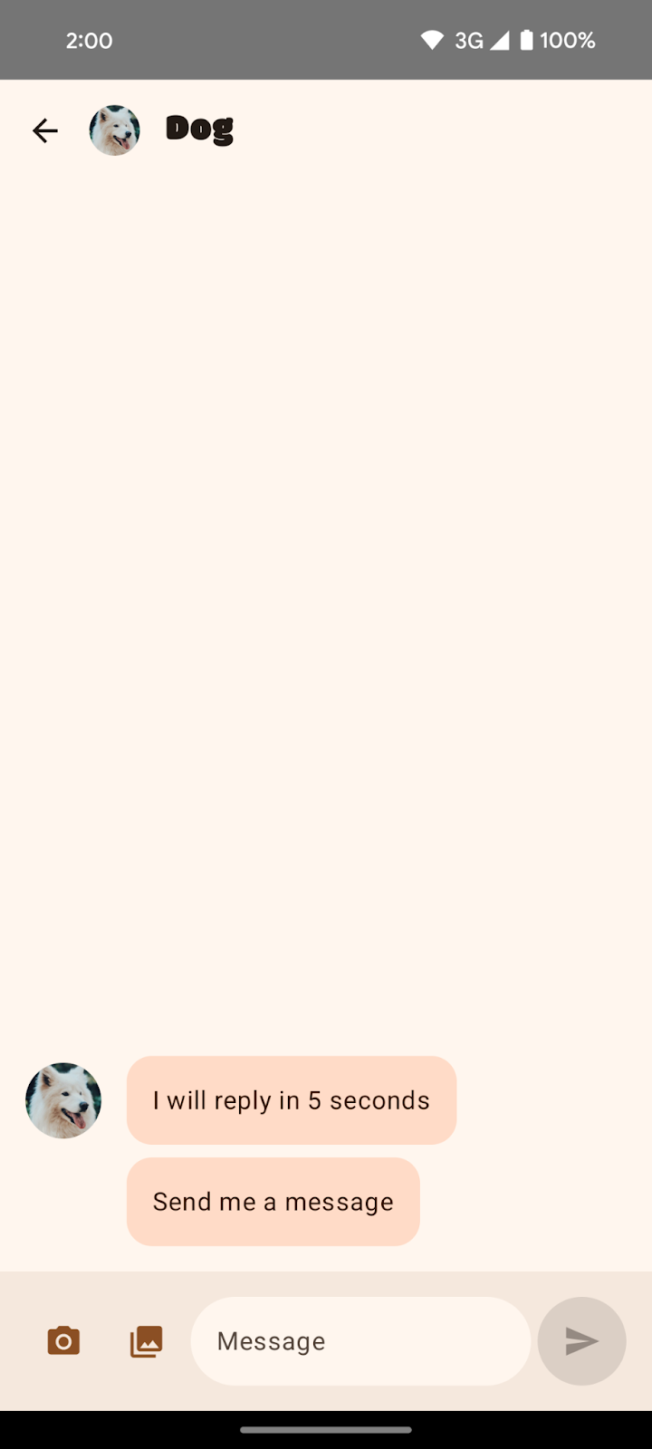
- Rerun the app on your Android 15 device.
Dog conversation in three-button navigation with insets incorrectly applied. | Dog conversation in gesture navigation with insets incorrectly applied. |


The bottom padding was applied so that the buttons are no longer obscured by the system bars; however, the top padding was also applied. The top padding encompasses the depth of the TopAppBar and the system bar. Scaffold passes the padding values to its content so that it can avoid the top app bar as well as the system bars.
- To fix the top padding, create a copy of the
innerPaddingPaddingValues, set the top padding to0.dp, and pass your modified copy intocontentPadding.
InputBar(
    ...
    contentPadding = innerPadding.copy(layoutDirection, top = 0.dp), //Add this line.
    // contentPadding = innerPadding, // Remove this line.
    ...
 )
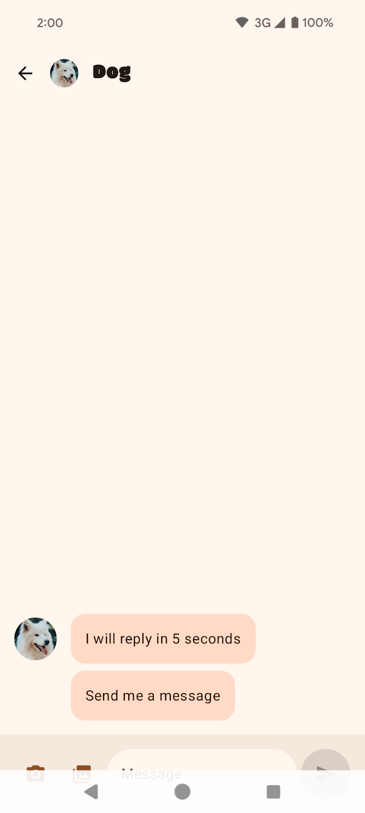
- Rerun the app on your Android 15 device.
Dog conversation in three-button navigation with insets correctly applied. | Dog conversation in gesture navigation with insets correctly applied. |


Congratulations! You made SociaLite compatible with the Android 15 edge-to-edge platform changes. Next, you learn how to make SociaLite edge-to-edge in a backward-compatible way.
4. Make SociaLite edge-to-edge in a backward-compatible way
SociaLite is now edge-to-edge on Android 15, but is still not edge-to-edge on older Android devices. To make SociaLite edge-to-edge on older Android devices, call enableEdgeToEdge before setting the content in the MainActivity.kt file.
class MainActivity : ComponentActivity() {
    override fun onCreate(savedInstanceState: Bundle?) {
        installSplashScreen()
        enableEdgeToEdge() // Add this line.
        window.isNavigationBarContrastEnforced = false
        super.onCreate(savedInstanceState)
        setContent {... }
    }
}
The import for enableEdgeToEdge is import androidx.activity.enableEdgeToEdge. The dependency is AndroidX Activity 1.8.0 or higher.
For an in-depth overview of how to make your app edge-to-edge in a backward-compatible way and how to handle insets, see the following guides:
This concludes the edge-to-edge portion of the pathway. The next section is optional and discusses other edge-to-edge considerations that might be applicable to your app.
5. Optional: Additional edge-to-edge considerations
Handling insets across architectures
Components
You might have noticed that many components in SociaLite did not shift after we changed the target SDK value. SociaLite is architected with best practices and so handling this platform change is easy. Best practices include the following:
- Use Material Design 3 components (
androidx.compose.material3), likeTopAppBar,BottomAppBar, andNavigationBarbecause they automatically apply insets. - If your app is instead using Material 2 components (
androidx.compose.material) in Compose, these components don't automatically handle insets themselves. However, you can get access to the insets and apply them manually. Inandroidx.compose.material 1.6.0and higher, use thewindowInsetsparameter to apply the insets manually forBottomAppBar,TopAppBar,BottomNavigation, andNavigationRail. Likewise, use thecontentWindowInsetsparameter forScaffold. Otherwise, apply the insets manually as padding. - If your app uses Views and Material components (
com.google.android.material), most Views-based Material Components (such asBottomNavigationView,BottomAppBar,NavigationRailView, andNavigationView) handle insets and so no additional work may be required. However, you will need to addandroid:fitsSystemWindows="true"if usingAppBarLayout. - If your app is using Views and
BottomSheet,SideSheet, or custom containers, apply padding usingViewCompat.setOnApplyWindowInsetsListener. ForRecyclerView, apply padding using this listener and also addclipToPadding="false". - Use
Scaffold(orNavigationSuiteScaffoldorListDetailPaneScaffold), notSurface, for a complex UI.Scaffoldlets you easily placeTopAppBar,BottomAppBar,NavigationBar, andNavigationRail.
Scrolling content
Your app might contain lists and the last item of the list may be occluded by the system's navigation bars with the Android 15 change.

Shows the last item in the list is occluded by three-button navigation.
Scrolling content with Compose
In Compose, use LazyColumn's contentPadding to add a space to the last item unless you are using TextField:
Scaffold { innerPadding ->
    LazyColumn(
        contentPadding = innerPadding
    ) {
        // Content that does not contain TextField
    }
}

Shows the last item in the list is not occluded by three-button navigation.
For TextField, use a Spacer to draw the last TextField in a LazyColumn. For more information, see Inset consumption.
LazyColumn(
    Modifier.imePadding()
) {
    // Content with TextField
    item {
        Spacer(
            Modifier.windowInsetsBottomHeight(
                WindowInsets.systemBars
            )
        )
    }
}
Scrolling content with Views
For RecyclerView or NestedScrollView, add android:clipToPadding="false".
<androidx.recyclerview.widget.RecyclerView
    android:id="@+id/recycler"
    android:layout_width="match_parent"
    android:layout_height="match_parent"
    android:clipToPadding="false"
    app:layoutManager="LinearLayoutManager" />
Provide left, right and bottom paddings from window insets using setOnApplyWindowInsetsListener:
ViewCompat.setOnApplyWindowInsetsListener(binding.recycler) { v, insets ->
    val i = insets.getInsets(
        WindowInsetsCompat.Type.systemBars() + WindowInsetsCompat.Type.displayCutout()
    )
    v.updatePadding(
        left = i.left,
        right = i.right,
        bottom = i.bottom + bottomPadding,
    )
    WindowInsetsCompat.CONSUMED
}
Using LAYOUT_IN_DISPLAY_CUTOUT_MODE_ALWAYS
Prior to targeting SDK 35, SocialLite looked like this in landscape where the left edge has a large white box to account for the camera cutout. In three-button navigation, the buttons are on the right side.

After targeting SDK 35, SociaLite will look like this where the left edge no longer has a large white box to account for the camera cutout. To achieve this effect, Android automatically sets LAYOUT_IN_DISPLAY_CUTOUT_MODE_ALWAYS.

Depending on your app, you may wish to handle insets here.
To do so in SociaLite, follow these steps:
- In the
ui/ContactRow.ktfile, find the Row composable. - Modify the padding to account for the display cutout.
@Composable
fun ChatRow(
   chat: ChatDetail,
   onClick: (() -> Unit)?,
   modifier: Modifier = Modifier,
) {
   // Add layoutDirection, displayCutout, startPadding, and endPadding.
   val layoutDirection = LocalLayoutDirection.current
   val displayCutout = WindowInsets.displayCutout.asPaddingValues()
   val startPadding = displayCutout.calculateStartPadding(layoutDirection)
   val endPadding = displayCutout.calculateEndPadding(layoutDirection)
   Row(
       modifier = modifier
           ...
           // .padding(16.dp) // Remove this line.
           // Add this block:
           .padding(
               PaddingValues(
                   top = 16.dp,
                   bottom = 16.dp,
                   // Ensure content is not occluded by display cutouts
                   // when rotating the device.
                   start = startPadding.coerceAtLeast(16.dp),
                   end = endPadding.coerceAtLeast(16.dp)
               )
           ),
       ...
   ) { ... }
After handling display cutouts, SociaLite looks like this:

You can test various display cutout configurations on the Developer options screen under Display cutout.
If your app has a non-floating window (for example, an Activity) that is using LAYOUT_IN_DISPLAY_CUTOUT_MODE_DEFAULT, LAYOUT_IN_DISPLAY_CUTOUT_MODE_NEVER or LAYOUT_IN_DISPLAY_CUTOUT_MODE_SHORT_EDGES, Android will interpret these cutout modes to be LAYOUT_IN_DISPLAY_CUTOUT_MODE_ALWAYS starting in Android 15 Beta 2. Previously, in Android 15 Beta 1, your app would crash.
Caption bars are also system bars
A caption bar is also a system bar as it describes the system UI window decoration of a freeform window, like the top title bar. You can view the caption bar within a desktop emulator in Android Studio. In the following screenshot, the caption bar is at the top of the app.

In Compose, if you are using Scaffold's PaddingValues, safeContent, safeDrawing, or the built-in WindowInsets.systemBars, your app will display as expected. However, if you are handling insets with statusBar, your app content may not display as expected because status bar does not account for the caption bar.
In Views, if you are manually handling insets using WindowInsetsCompat.systemBars, your app will display as expected. If you are manually handling insets using WindowInsetsCompat.statusBars, your app might not display as expected because status bars are not caption bars.
Apps in immersive mode
Screens in immersive mode are largely unaffected by the Android 15 edge-to-edge enforcements, as immersive apps are already edge-to-edge.
Protecting system bars
You may wish your app to have a transparent bar for gesture navigation, but a translucent or opaque bar for three-button navigation.
In Android 15, a translucent three-button navigation is the default because the platform sets the window.isNavigationBarContrastEnforced property to true. Gesture navigation remains transparent.
Three-button navigation is translucent by default. |
In general, a translucent three-button navigation should be sufficient. However, in some cases, your app might require an opaque three-button navigation. First, set the window.isNavigationBarContrastEnforced property to false. Then, use WindowInsetsCompat.tappableElement for Views or WindowInsets.tappableElement for Compose. If these are 0, the user is using gesture navigation. Otherwise, the user is using three-button navigation. If the user is in three-button navigation, draw a view or box behind the navigation bar. A compose example might look like this:
class MainActivity : ComponentActivity() {
    override fun onCreate(savedInstanceState: Bundle?) {
        super.onCreate(savedInstanceState)
        setContent {
            window.isNavigationBarContrastEnforced = false
            MyTheme {
                Surface(...) {
                    MyContent(...)
                    ProtectNavigationBar()
                }
            }
        }
    }
}


// Use only if required.
@Composable
fun ProtectNavigationBar(modifier: Modifier = Modifier) {
   val density = LocalDensity.current
   val tappableElement = WindowInsets.tappableElement
   val bottomPixels = tappableElement.getBottom(density)
   val usingTappableBars = remember(bottomPixels) {
       bottomPixels != 0
   }
   val barHeight = remember(bottomPixels) {
       tappableElement.asPaddingValues(density).calculateBottomPadding()
   }

   Column(
       modifier = modifier.fillMaxSize(),
       verticalArrangement = Arrangement.Bottom
   ) {
       if (usingTappableBars) {
           Box(
               modifier = Modifier
                   .background(MaterialTheme.colorScheme.background)
                   .fillMaxWidth()
                   .height(barHeight)
           )
       }
   }
}
Opaque three-button navigation |
6. Review the solution code
The onCreate method of the MainActivity.kt file should look like this:
class MainActivity : ComponentActivity() {
   override fun onCreate(savedInstanceState: Bundle?) {
       installSplashScreen()
       enableEdgeToEdge()
       window.isNavigationBarContrastEnforced = false
       super.onCreate(savedInstanceState)
       setContent {
           Main(
               shortcutParams = extractShortcutParams(intent),
           )
       }
   }
}
The ChatContent composable within the ChatScreen.kt file should handle insets:
private fun ChatContent(...) {
   ...
   Scaffold(...) { innerPadding ->
       Column {
           ...
           InputBar(
               input = input,


               contentPadding = innerPadding.copy(
                    layoutDirection, top = 0.dp
                ),
               sendEnabled = sendEnabled,
               modifier = Modifier
                   .fillMaxWidth()
                   .windowInsetsPadding(
                       WindowInsets.ime.exclude(WindowInsets.navigationBars)
                    ),
            )
       }
   }
}
The solution code is available in the main branch. If you've already downloaded SociaLite:
git checkout main
Otherwise, you can download the code again to view the main branch either directly or through git:
git clone git@github.com:android/socialite.git